VIZUALIZE
A UX CASE STUDY PRESENTED BY
MJ BLACKWOOD
Creatives are some of the most fascinating, unique, and passionate people. They also struggle to find meaningful and lasting connections outside of their social network.
Vizualize is my answer to that.
PROBLEM
Design an app to connect visual creatives with experts so they can feel more informed and better prepared to solve difficult creative problems.
SOLUTION
Vizualize is a multi-platform app for visual artists and craftspeople to meet and connect with peers, begin a mentorship, and find verified resources to help them improve their craft.
MY ROLE
I was in charge of taking the brief for this student project from ideation to execution. That included all foundational UX work like surveys and interviews, wireframing and prototyping, user testing, and visual polishing.
THE PROBLEM
I was asked to create a web app with the brief
“give people a simple, intuitive way to connect with an expert so they can feel more informed and better prepared to face their problems.”
Immediately I knew there was something real and personal that I could tackle.
I received my BA in Illustration, and found myself and my peers feeling disconnected from each other and our more experienced seniors after graduation. This was doubly so for my self-taught friends. It can be a struggle to meet like-minded individuals in your craft and not feel like a bother.
(I’ve talked to folks, the idea of sending a DM to a mutual asking “Can you look at my art?” can be a bigger hurdle than asking a celebrity for an autograph.)
I wanted to see what I could do about it.
Our creative users need a way to connect with experts in their field because they need a mentor figure to ask about industry-specific advice.
Our expert users need a way to connect with students in their field because they wish to share their skilled knowledge with their peers and be rewarded for it.
PROBLEM STATEMENTS
Jumping off from the problem, I developed those ideas into the manageable hypotheses above. These gave me a waypoint from which to explore and research.
VERIFY AND UNDERSTAND
Identify users’ attitudes surrounding mentorship and connections in the visual art field
Better understand user behavior around solving visual art problems
Collect data about the context in which users seek out online tools for visual art help
RESEARCH GOALS
I knew there was precedent in my art circles for this connection frustration, but I wasn’t going to jump into something based on anecdotal assumptions. I needed to know that I wasn’t solving a problem that didn’t exist. I set research goals to keep my exploration on track.
An initial user survey confirmed that nearly 70% of 13 participants had 0-1 mentor figures they could reach out to (69.3%), and the people who had zero mentor figures totaled over 46% of all participants.

Problem Solving?
Participants who commonly ran into difficult problems were more likely to be interested in a mentorship app.
Interested in Peers?

Peer connections were considered to be more important than initially expected.

How Confident?
There was no clear consensus on how confident participants felt on receiving an answer back from an expert when they needed it.
SURVEY INSIGHTS
So what did I take away from the survey?
I came away with the understanding that we needed to know more before finalizing a direction for the app.
I consolidated three key insights in the form of questions, to narrow down what I wanted to pursue in the next round of research.
These insights were directly taken from data uncovered in the survey.
For example, Although 9 people (69.2%) answered that they have either none or one mentor figure they could confidently reach out to in question 8, we got an interesting array of answers with no clear consensus to question 9:

Since there is no clear consensus, I’d like to see what are some of our potential users' thought processes behind this.
”What gives you confidence that your mentor figure will get answers back to you?”
”What makes you feel unconfident about it?”
This limited the focus for the next stage of research, keeping the interview script efficient and centered on what I actually needed to uncover in order to understand the “why” behind the users behavior.

Solution Seeking
Participants prefer to do their own online research to solve problems, but it has strong roadblocks including a) lots of information is unverifiable in its credibility, and b) lack of consolidation causes research to take many hours.
Peer-Minded
Peer networking is as important to participants as networking with expert/mentors.

Imposter Syndrome
Participants struggled with confidence the most when looking for helpful information or trying to make new connections.
INTERVIEWING INSIGHTS
The most notable takeaways about our target users were that creatives are seeking peer connections, and spending hours of time online researching.
Notable, because both of those weren’t covered in the initial conceptualization, but they were incredibly important to the people interviewed.
In this case, both could be covered by plausible and reasonable features, meaning I could make a more useful tool for my users.
These insights were synthesized from 3 ~30 minute interviews through affinity mapping.
With a small number of interviews, affinity mapping was an extremely efficient method to visualize all the collected data and sort out the most important points to focus on for the business objectives and design goals.

An additional hypothesis was created to account for the real and unforeseen problem of research exhaustion:
Our researching users need a way to easily sort through verified resources, tips, and techniques because they need to save time when researching information about their craft.
USER WHO?
Armed with research, insights, and three verified hypotheses, I set about humanizing all this data. Creating faces for each of our hypothetical user types allowed me to better visualize nebulous “users” as real people.
“User,” “Mentor,” “Mentee,” and “Researcher” are pretty generic terms, but Logan, Deshaun, and Claire we can get to know:


With personas to relate to, I could then easily follow how they might move through the app.
Creating a journey for each persona allowed me to have a more focused vision for designing the app, as narrative overviews like these are far more accessible than documents of raw research data.


From these overview journeys I was able to narrow down core goals users would need to accomplish.
Book A Call
Manage My Schedule
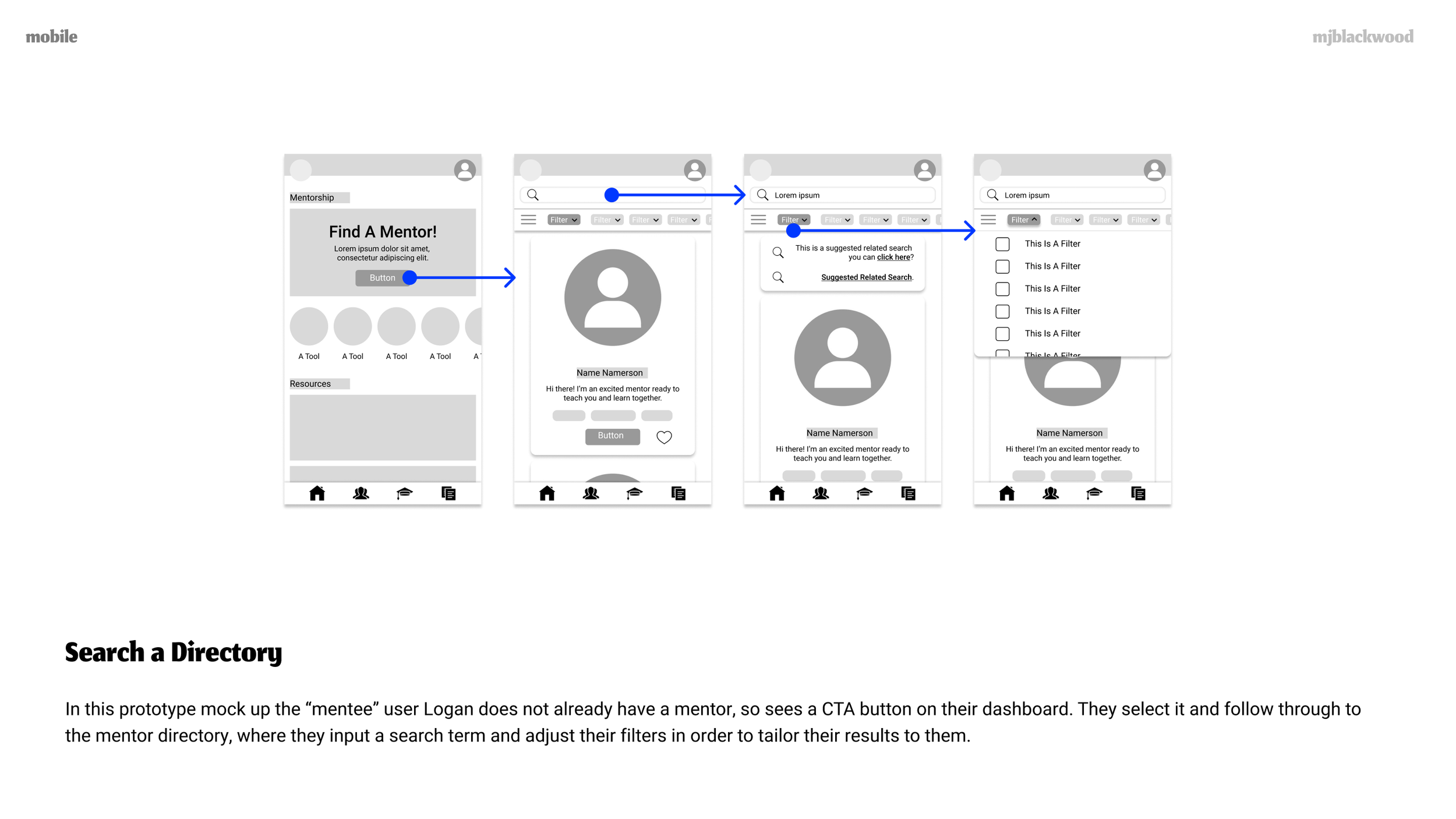
Search Directory
Each of these core goals would have to be completed for the app to be useable.
In the following user flows every goal was broken down into the actions, interactions, and pages necessary to successfully complete the task.


ITERATE, ITERATE, ITERATE
Each of the user flows then filtered directly into forming the picture of the sitemap.
I also knew that the mentor and resource directories would be kept separate from the rest of the site that’s only accessible if you have an account. That way visitors can browse or test the directories first. This correlates with competitive IA and offers prospective users the ability to “trial” the app.
With this first draft of the map completed I was then able to challenge my assumptions and define/refine the sitemap with card sorting.

Since the app’s IA is being created and tested for the first time, open sorting was chosen to show how people naturally sort the app’s data (apart from my own assumptions).
Five participants took part, and their data was sorted into a standardization grid so I could easily look for patterns and interesting insights.
Here are some of those key points:

Multiple groupings of cards were placed into the same group by every participant, particularly the information pertaining to contacting/learning about the app’s company.
Consistent Grouping

Most sorted “manage schedule” under Profile, not Account nor a scheduling/payment group which was surprising to me.
Profile > Schedule

“Video Call Tool” and “Messages From Mentor” were split between mentorship and social.
Communication
Payment

No consensus on where to sort payment (pay, get paid, manage subscriptions), so I decided based on the grid the most reasonable point would be under Account.
Using this data, the map was revised into a second version.
The directories were left alone (in keeping with competitive IA and accounting for non-account users), while the hierarchy under ‘dashboard’ was changed to comply with what I had learned about users' mental models.
Having this solid information architecture map was vital to me.
While I’d been building upon every previous piece throughout the project, having a solid base here would give me the foundation on which to build rapid iterations.
I worked from the broad to narrow, beginning with navigation, down to features and interactions.
Through this iterative process I revised the core features to focus on. I decided that the main selling point of the app was being able to connect with an expert in your field, so I needed to focus on features that directly correlated.
The three core goals were updated to be:
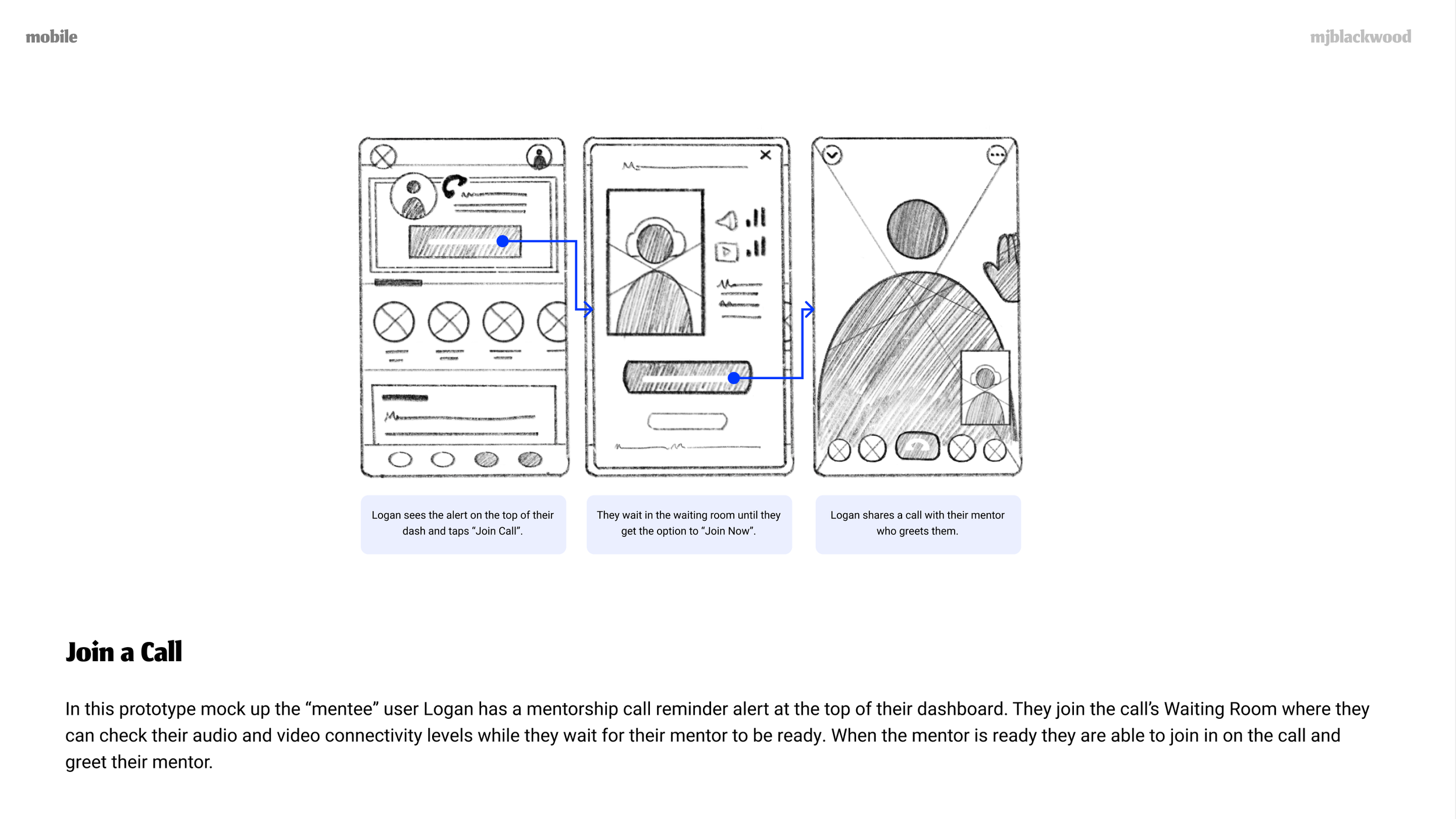
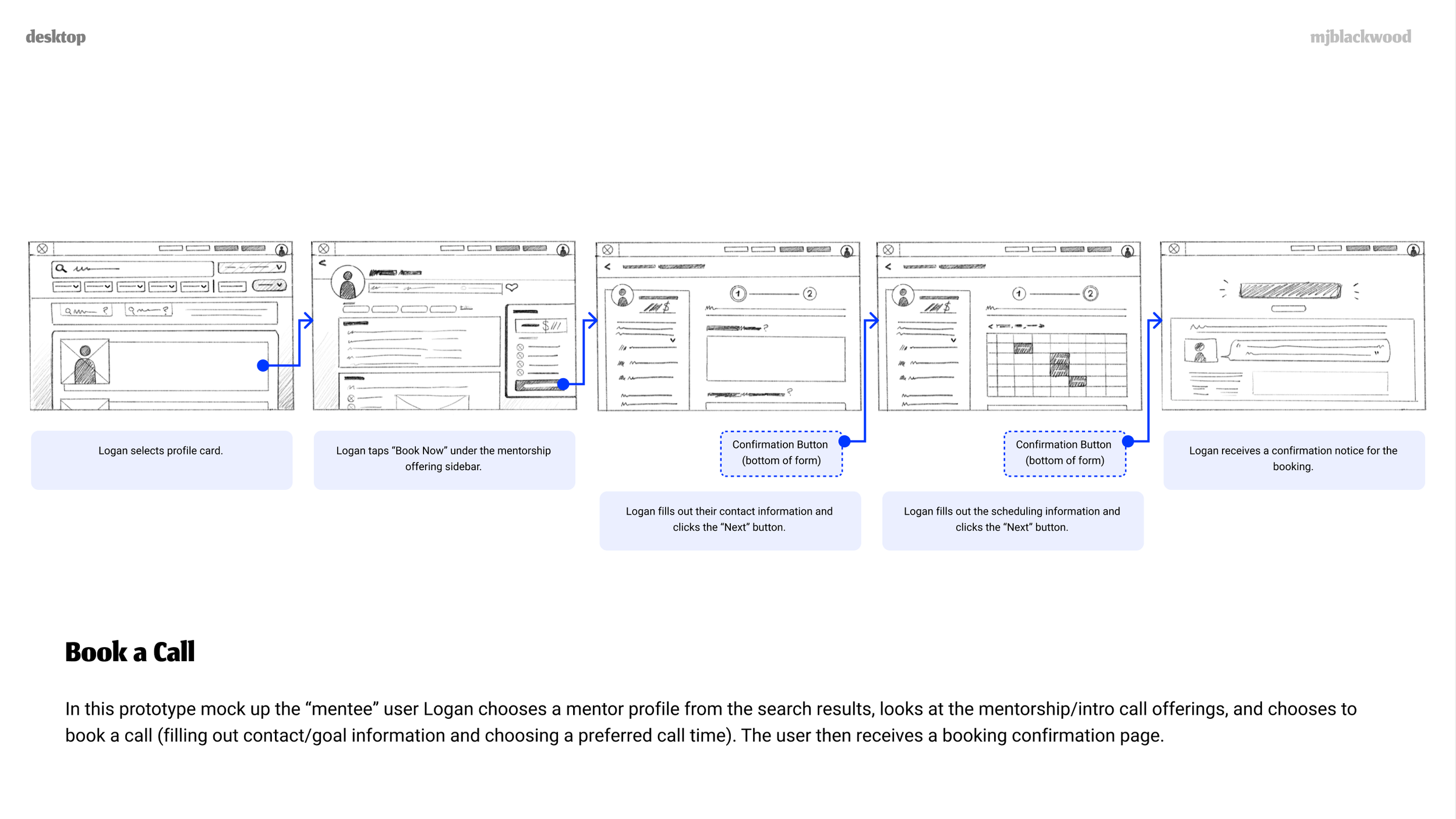
Book A Call
Join A Call
Search Directory
This setup was far easier for me to follow, since each of these goals translate directly from one to the next. These are Mentee goals, which were chosen since it’s the primary persona and represents the main target user for the app (making it the highest priority for the MVP).
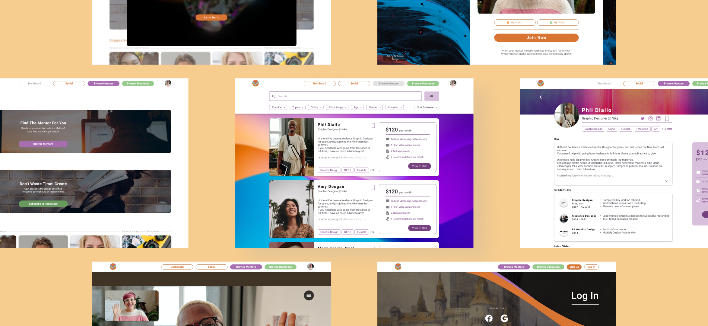
With two passes of lo-fi wireframes, I now had my main screens completed, allowing me to move forward and expand on those wireframes.
I laid them out as paper prototypes, giving me my first look at how the app would function at a high-level without wasting time on details or visual design that could change.
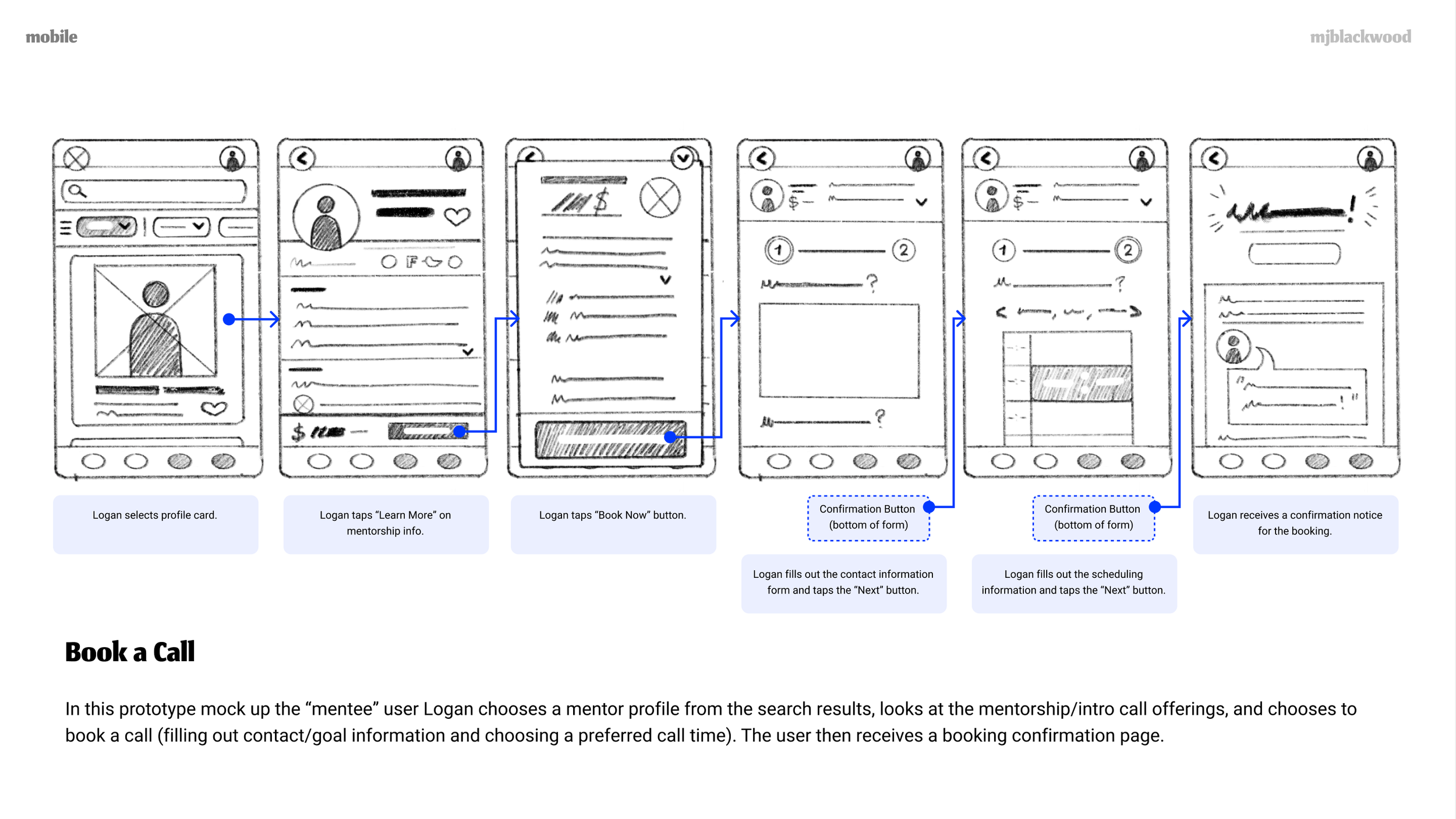


I went through all of these and noted improvements that could be made when moving to digital mid-fidelity. Some of those improvements are listed as follows:
Add in missing buttons as clickpoints
Add in minimum copy for comprehension
Flesh out cards to meet minimum function standards
Flesh out how forms will be filled in and submitted
I then implemented these on the next pass:


These mid-fi wireframes allowed me to create a testable prototype.
I needed to know if the base functionality was usable and useful before continuing to high-fidelity, so I began the prep work for usability tests.
USABILITY TESTING
MAIN GOAL
The main goal of this study is to assess if users are able to complete basic functions, and what level of errors and attempts at error management users will encounter throughout their use of the mid-fi prototype.
SECONDARY GOAL
We would like to assess if users understand the project’s nature and its value after interacting with it for the first time.
USER TESTING GOALS
Six people participated over two days of testing to determine their ability to complete tasks, level of errors (Nielsen’s Scale), and satisfaction (ASQ) with their experience using the mid-fidelity prototype.

Multiple key issues were uncovered through testing the mid-fidelity prototype.
Below you can find the top three issues ranked by priority.
Check out the report above to see all top five issues discovered!
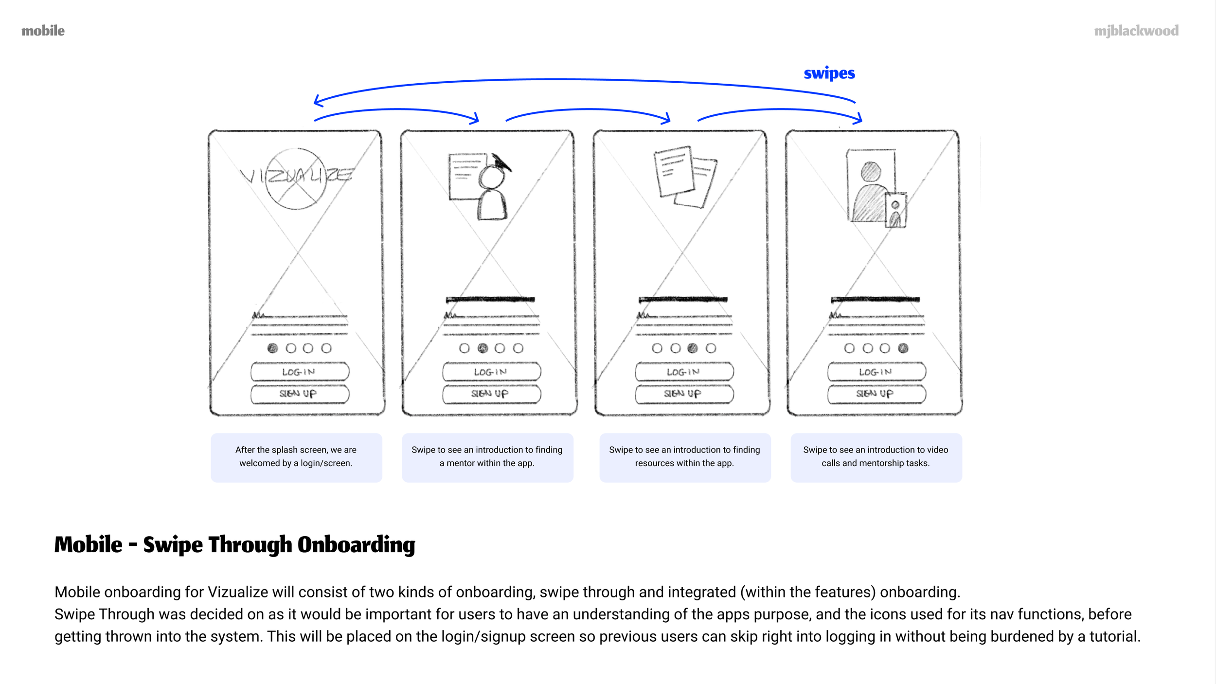
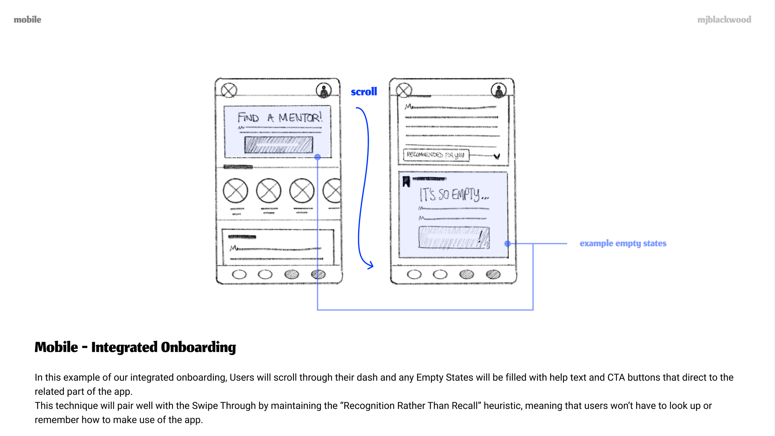
Mobile Onboarding Ignored
Proposed Change: Make dot nav more prominent. Bring to hi-fi.
Supporting Evidence: Increasing the nav in hierarchy may increase its visibility, and hi-fi visuals will be more enticing than gray.
“Learn More” Button in Mobile Booking Flow Ignored
Proposed Change: Add a CTA section at the bottom of the profile for multiple navigation points. Change button copy to fit user expectations.
Supporting Evidence: Users attempted to scroll to find an “apply” now button. All users cited confusion with the flow, so adaptation is necessary.
Nav Icons Caused Users to Be Unsure of Location
Proposed Change: Create a consistent style guide. Indicate directory pages with color rather than filled/unfilled. Fill active location only.
Supporting Evidence: Generally accepted design guidelines and heuristics for consistency and the most familiar use case for filled/unfilled icons.
Through all of these issues that were uncovered, there were a few running themes.
These “next steps” are listed as follows:
Create Consistent Style Guide
Bring Prototype to High Fidelity
Add Missing/Replace Placeholder Screens/Copy/Content
I found that most of the errors and issues directly stemmed from a lack of comprehension of the prototype itself.
“It’s so limited, I’m not sure how to give advice.”
Participants tried to scroll on one page and couldn’t, but could on another. Text blocks were represented by gray rectangles, but buttons and filters were also represented by shapes in the same color. These things (and more) all created visible friction.
This was a fantastic learning moment for me.
I learned more about how people interact with prototypes, and I now have a better sense for when is a good time to bring in people for testing.
If I had to do this over again I would better flesh out the mid-fidelity prototypes, with more copy, less placeholders, and consistent interactions before testing them.
In an ideal world, if cost and scope were of no issue, I would complete another round of usability testing. I would use the second round to narrow down which errors stemmed from the functionality of the design itself, rather than from the prototype’s flaws.
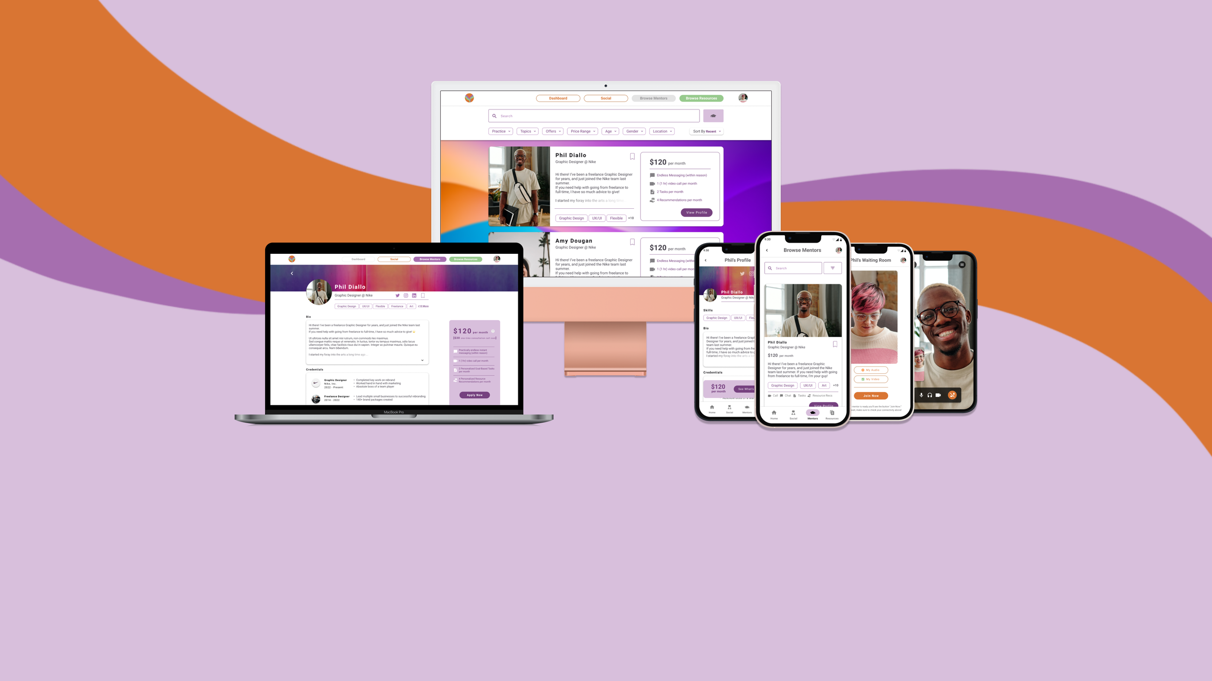
ENTER MATERIAL
I upgraded my wireframes from mid fidelity to high, keeping in mind all the solutions I needed to implement as well.
While I was working on this I decided to dive into how I could easily and effectively integrate a consistent style into my work. I began with looking at Material Design’s documentation as a guide, before deciding that using their design kit and guidelines overall would save me so much time in the long run, as well as solving many of my problems.
I explored and justified this all first before implementing anything on the actual file:


I then began the process to integrate Material Design 3 components while adding new copy, content, and refining the visual design overall.

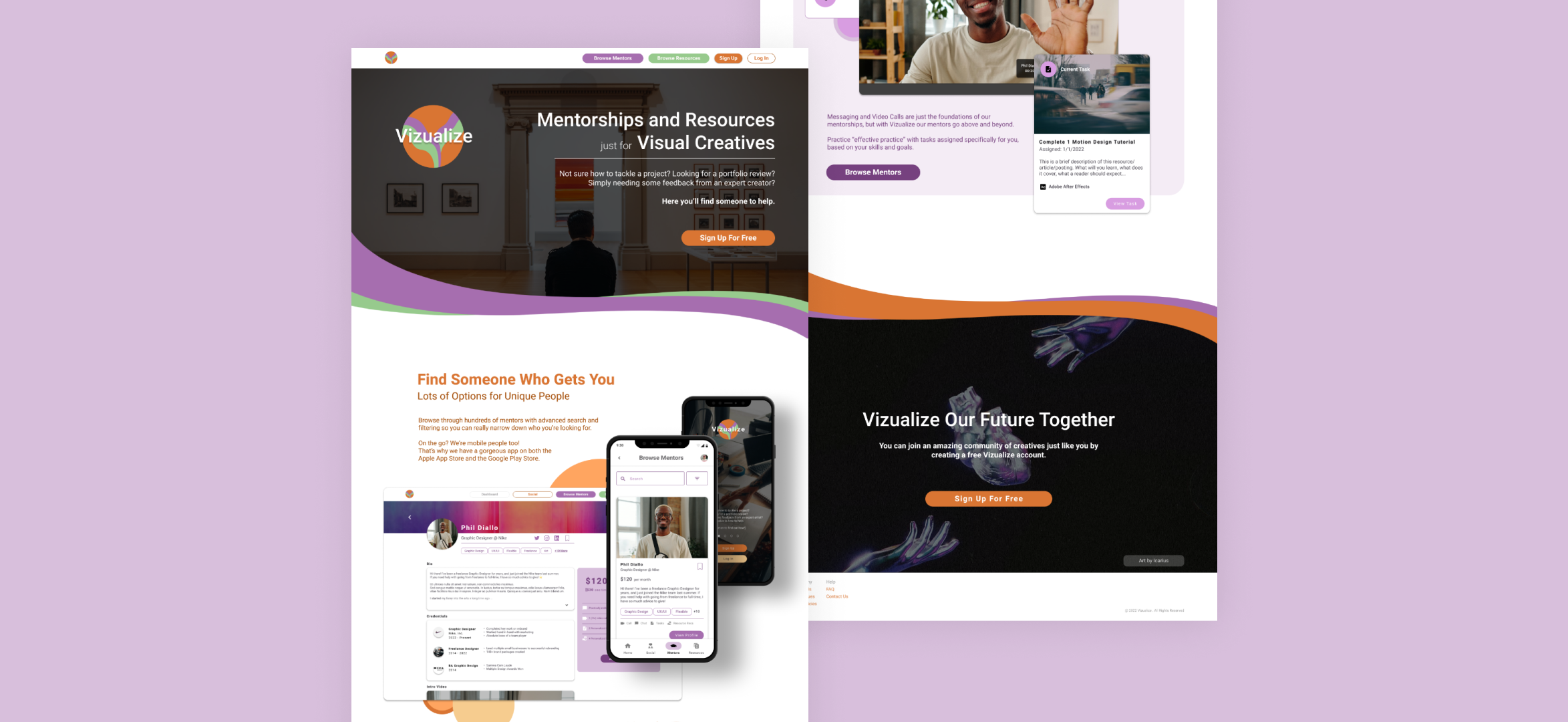
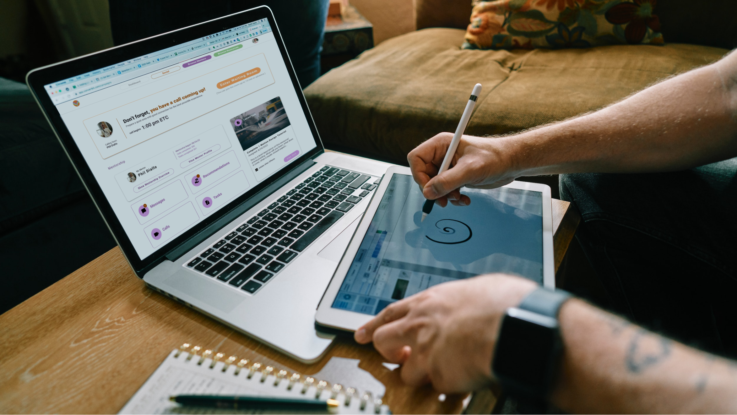
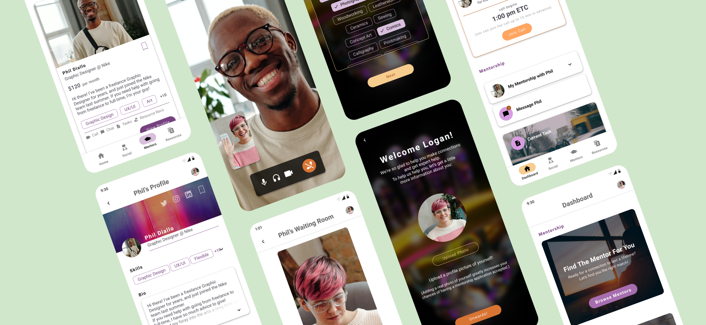
PRESENTING VIZUALIZE
With consistent work and effective planning and organization, I finalized Vizualize’s design to a clean, fun, and professional standard.
I’d like to highlight the style guide and design system for the app, which I worked on creating before and during the material design integration. This document gave me a rock solid idea of what the brand’s identity was and the standards we held ourselves to, allowing me to make every screen feel like it came from the same family.