
A UI CASE STUDY PRESENTED BY
MJ BLACKWOOD
PROBLEM
Design and brand a fitness app for a young market that engages and excites users in a modern and relatable way.
SOLUTION
Fit Check is a rewards and awards based exercise app that is based in new and fashionable trends, both in visual and experience design.
MY ROLE
I was in charge of taking a brief with foundational UX work, and creating the brand and user interface (UI) from that starting point. While I did create the design objectives for this student project, my primary role was developing the visual look.
So how did I accomplish that?
Let’s take a look at the foundational work that I started the project with.
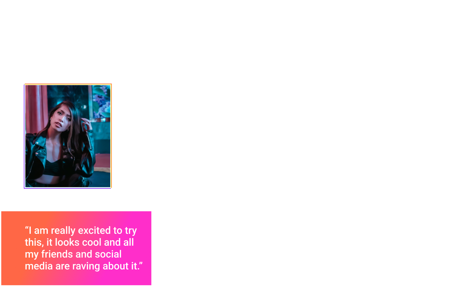
Rebecca is our primary user persona, and I’ll be thinking about her and her needs a lot as I work out the branding that will excite her and her friends to join.
And here in a simplified form are the design objectives.
I referred back to these throughout the project to make sure the visuals aligned with the design goals:
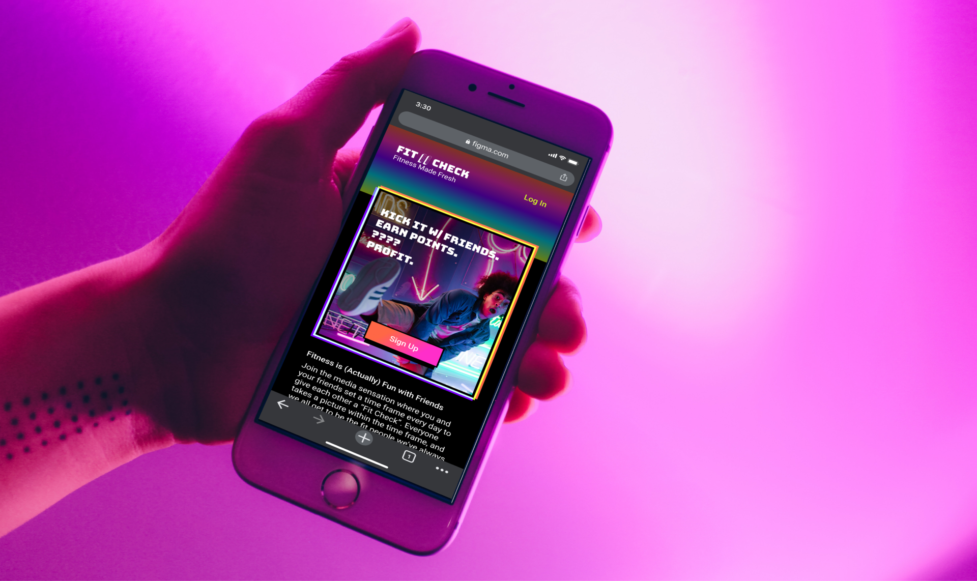
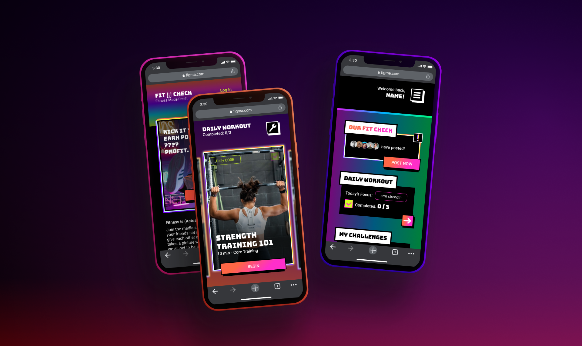
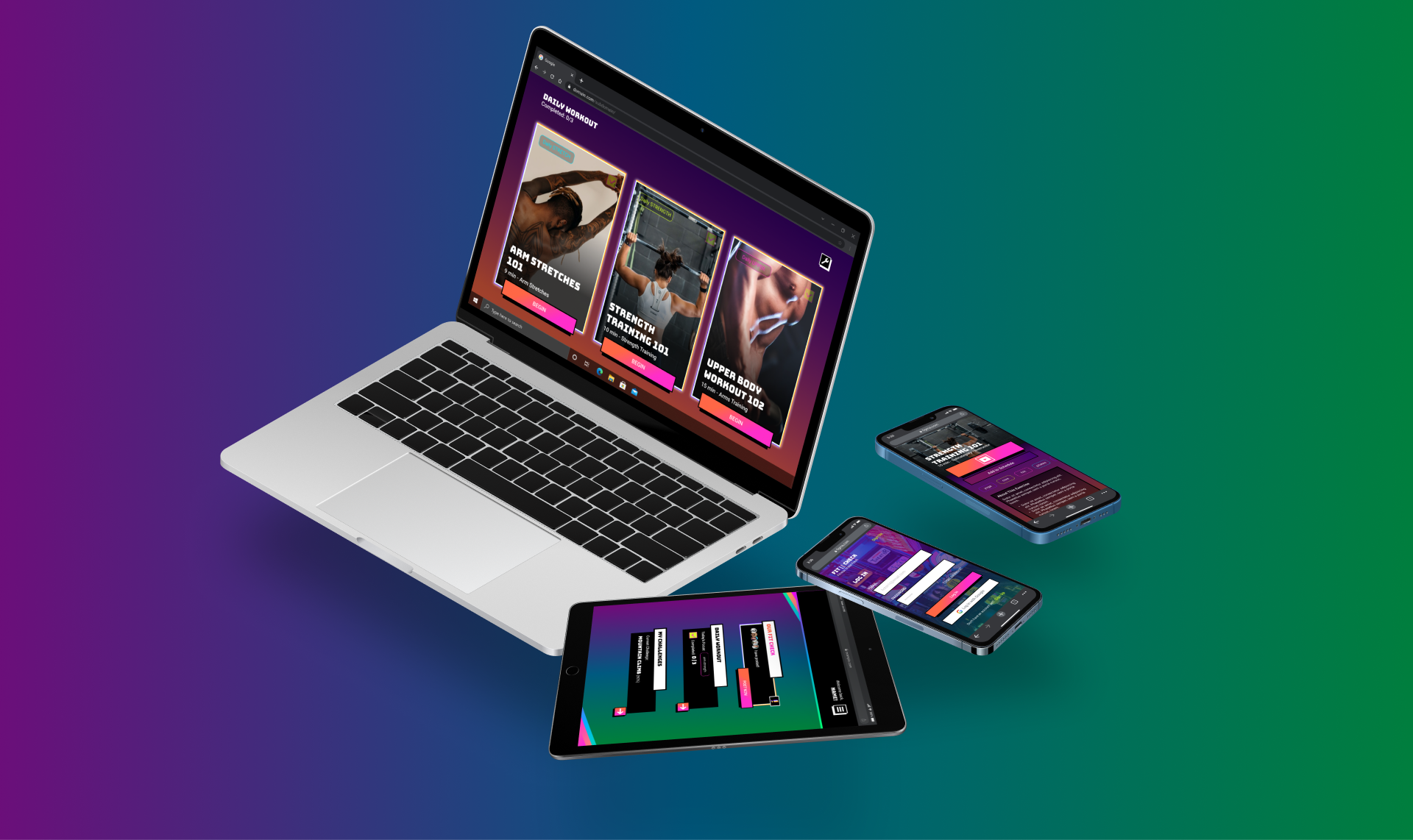
Fit Check is a responsive web app that users can use on any device.📱
Fit Check is primarily a fitness app, but not a hardcore app intended to engage users with serious health goals. It is a casual and enjoyable social experience just as much as a fitness app. 🤗
Fit Check uses rewards and awards to keep users engaged with the app and each other through the use of a points exchange system. 🎉
Fit Check merges the exciting new trend of apps like Be Real with a fitness function to make exercise more social and accountable than ever.
Fit Check’s primary user is modern and fashionable, interested in trends, and an older teen/young adult. 😎
With all of that in mind, I began sketching the first iteration of the wireframes for the app, quickly followed by a digitized mid-fidelity version.

LO-FI PAPER PROTOTYPE

MID-FI PAPER PROTOTYPE

During this part of the process I focused the wireframes on the minimum viable product that would allow the app’s features to function.
With that solidly drafted, I came to the meat of the project:
Designing a compelling brand and merging it with the planned functionality.
What would get Rebecca and her friends excited and willing to try something new?
And then what would be cool and interesting enough to keep them engaged?
Fit Check’s design objectives were already leaning into the new and trendy with the social systems implemented (based on up and coming social media like Be Real), so I decided to design distinctly for that demographic. Young people who are interested in new social tech experiences, like Rebecca, would respond to a look that matched them, rather than designs reminiscent of pre-existing fitness apps.
To visualize these concepts, I designed some moodboards..


I decided to move forward with the first moodboard as it conveys the intensity and use-case of the “brand” the best of the two.
Moodboard two was considered for its positivity and energy, but it was determined that it might actually come across as “too youthful,” potentially alienating users who might think it’s not for their age group.
The first design also matches a level of irreverence and eccentricity I’ve noticed in modern youthful brands, which I believed would align it well with upcoming aesthetics.
I took that forward and narrowed down color schemes, fonts, and logos.
With a solid brand concept coming together, both visual and narrative,
I updated the wireframes iteration by iteration to incorporate the new branding.
(All of this was done in tandem to make the best use of my time and create changes and updates on the fly, rather than leaving it to a massive update at the end simply to find many deep errors that needed to be fixed.)
ITERATIONS OF THE
DAILY WORKOUT SCREEN


POLISH, FINISH, POLISH…
At this point, my screens are at high fidelity and the brand is looking good and consistent.
But is that enough to keep Rebecca continuously checking in to Fit Check?
Alongside good UX and quality content offered, how else could I ensure Rebecca stays engaged while using the app?
Since a main function of the app is gaining awards through earned points (which you can show off to friends), highlighting points and awards would be a great and time effective way to inject some surprise delight.
I then designed a simple mockup of a dialog animation in Figma, that could, for the shipped product, be finalized in motion design software like After Effects.


This animation came while polishing the project, but I wouldn’t have arrived at this step without creating guidelines for all my branding to follow.
If you are curious about digging into those guidelines that I created for Fit Check, please check out the Style Guide below…

At this point I’d launch a full handoff to development, staying a helpful hand for anything that comes up.
Someday Fit Check might get its chance to take off, but in the meantime I’m always working on something and open to new projects and proposals.
Let me know if you’re interested in working together, and check out more of my work
with the < arrows > below.
THANK YOU FOR READING,
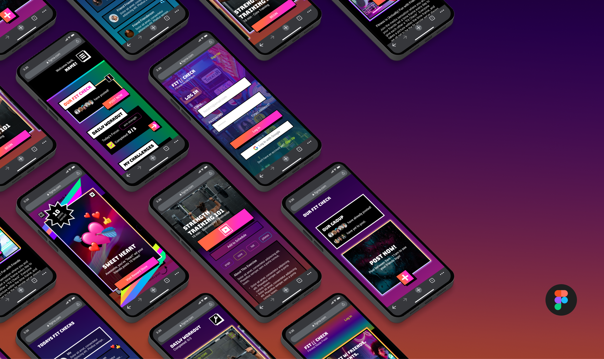
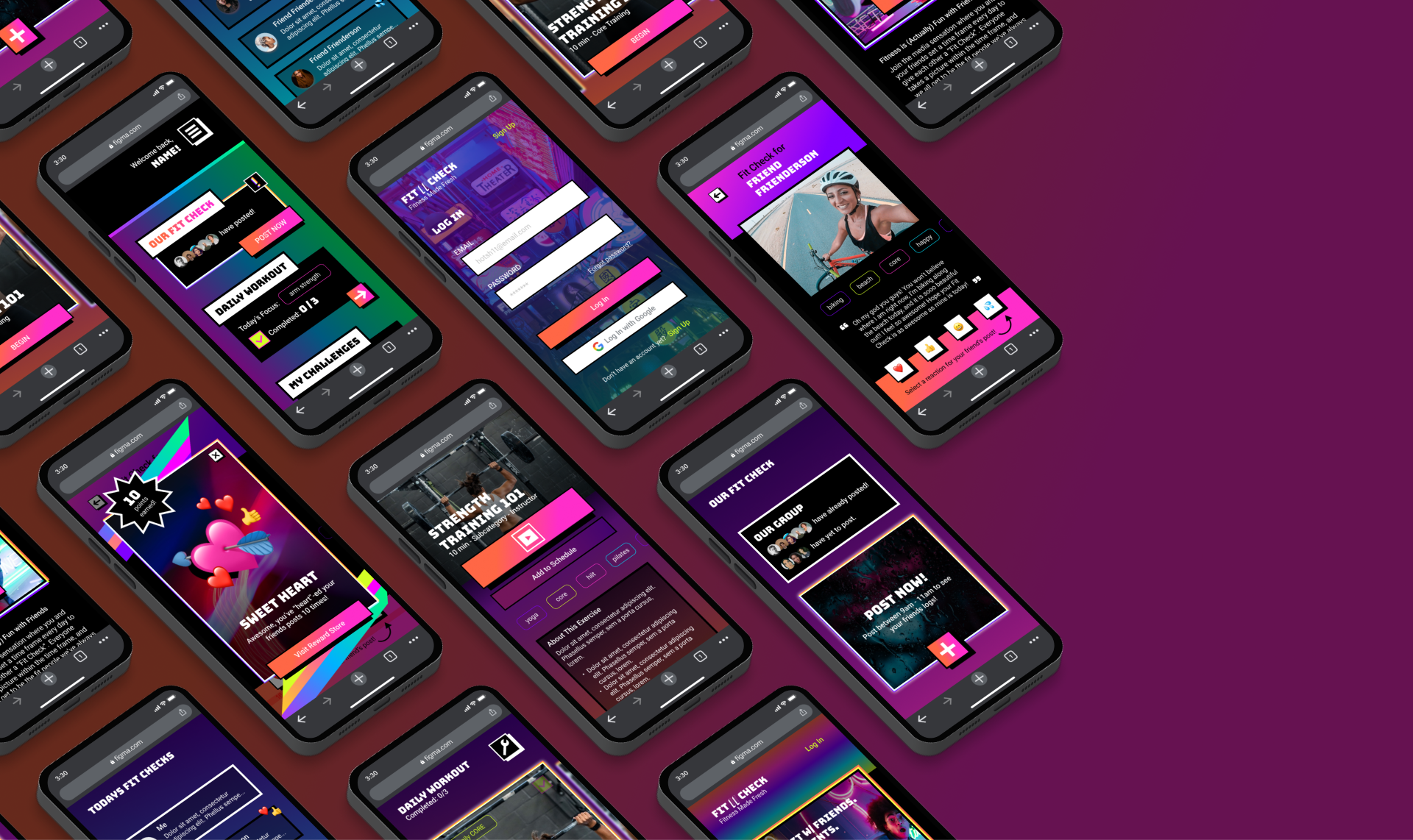
here’s the beauty shots…
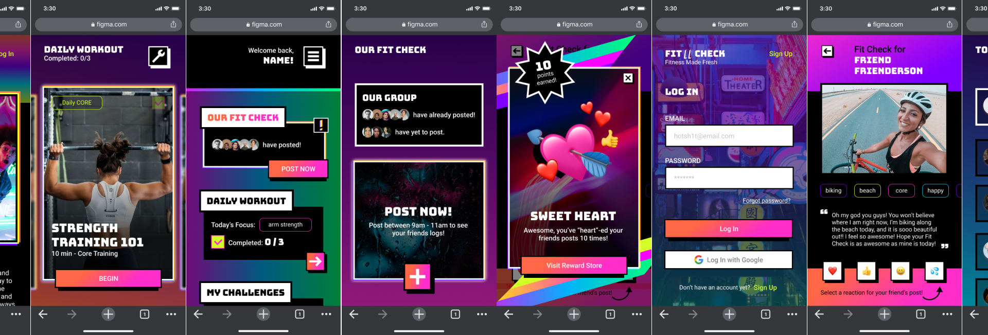
...mock ups...
...mock ups...

A UI CASE STUDY PRESENTED BY
MJ BLACKWOOD
2022