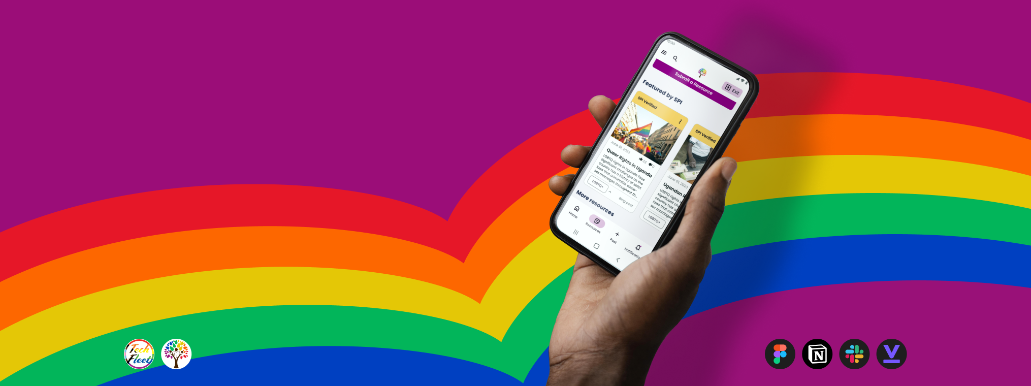
TDAConnect
A UX CASE STUDY PRESENTED BY
MJ BLACKWOOD
Problem:
Design a Resource Center where marginalized users can find important and useful information in a central trusted location. Design within the bounds of multiple constraints from stakeholders and users.
Solution:
Utilize constraints as opportunities to create a design that meets needs while maintaining feasibility.
Client had limited bandwidth for resource center maintence and moderation. So we shifted the focus to community sourcing and moderation, allieviating additional work on the client end and encouraging community building on the user end.
My Role:
I shifted from UX Designer to Senior UX Designer throughout the project, maintaining a hands on attitude to the visual design while also leading the team during a sprint in a lead’s absence.
Throughout the project I worked hands on in creating storyboards, sketches, lo-fi to hi-fi wireframes, component design, design system management, and interactive prototypes. I was directly in charge of designing the Resource Section’s main page, as well as the user flows for searching in the “Health” sections.
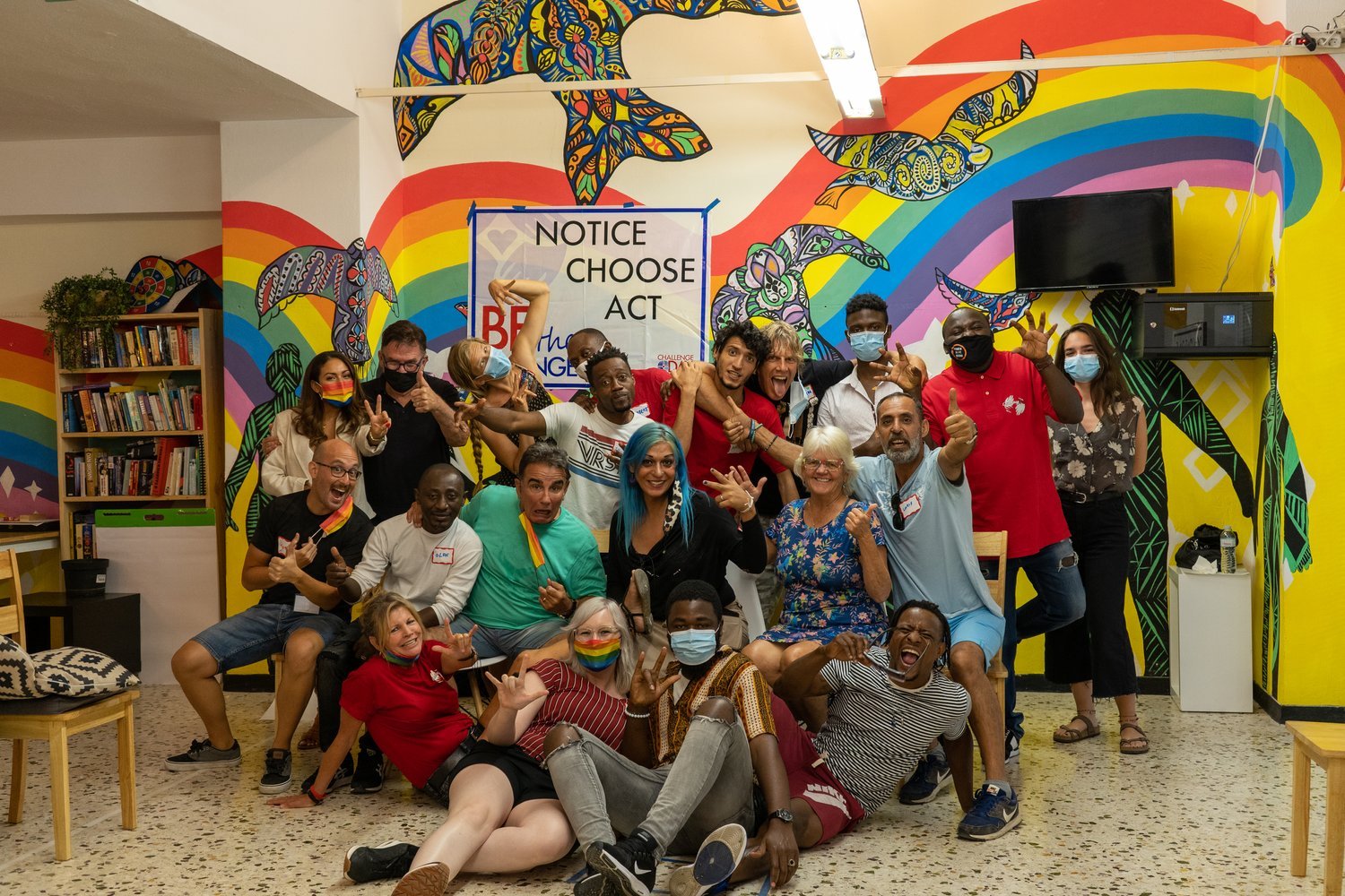
Some Context
Client:
Safe Place International (SPI) is a holistic leadership development organization for displaced LGBTQIA+ individuals. They run multiple non-profit programs under three pillars - Protect, Connect, and Lead.
Project:
One of SPI’s programs under “Connect” is called The Dream Academy (TDA). It’s a structured course for LGBTQIA+ displaced persons to reach their full potential through leadership development, socio-emotional learning, and employability skills training.
But SPI found that there was a significant dropoff of TDA alumni interaction (~50-70%) after graduation. Seeing an opportunity to build a community, SPI sought out TechFleet to build a digital platform for their TDA Graduates: TDAConnect.
The project has gone through previous phases before my involvement, including a Phase 0 and Phase 1. These preliminary phases set up the core research and designs, particularly for the designs for the core function of a social media feed.
Team:
Our UX Design team of 7 entered the project in Phase 3, in a larger team of 37 total teammates spread across multiple disciplines including research, development, content, and more.
Our team was tasked with designing the Resource Center in order to tackle the problem of alumni dropoff after graduation.
Serena Hochmuth
Co-Lead
Miguel Lucas
Co-Lead
Edie Cruise
Manjiri Phatak
Pyke Relucio
Janet Xu
Miles “MJ” Blackwood
Me!
So, What’s The Problem?
SPI had tasked us with creating a resource center for their post-graduates.
But what would a resource center actually require?
A place where resources could live and strong enough information architecture to make it easy to navigate.
But SPI’s users aren’t just people researching on wikipedia or browsing on reddit. This is a specific group of people with distinct needs.
Constraints
Our team collaborated with the research team in our first sprint to test what the first phase of the project had discovered.
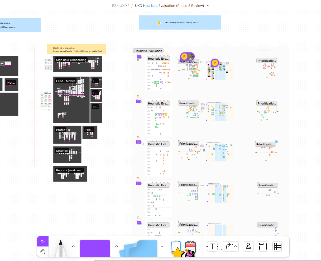
The very first thing we did was combine both UX teams and review the materials and components from Phase 1.
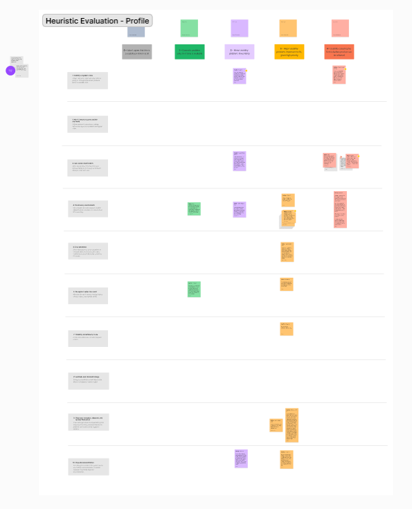
I buddied up with a UXD1 teammate and together we reviewed the “Profile” flow developed in Phase 1.
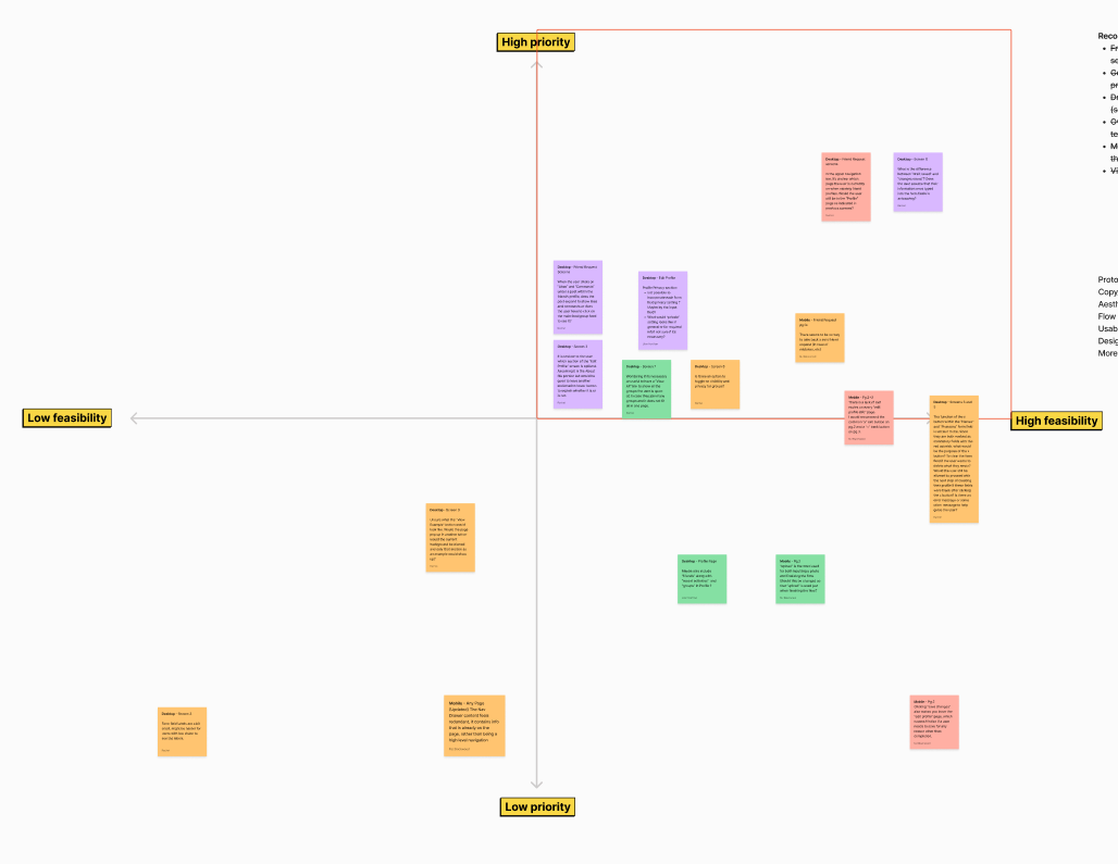
Every pair used a priority matrix to make a list of fixes in an accessible order. This shows the matrix my buddy and I put together for the “Profile” flow.
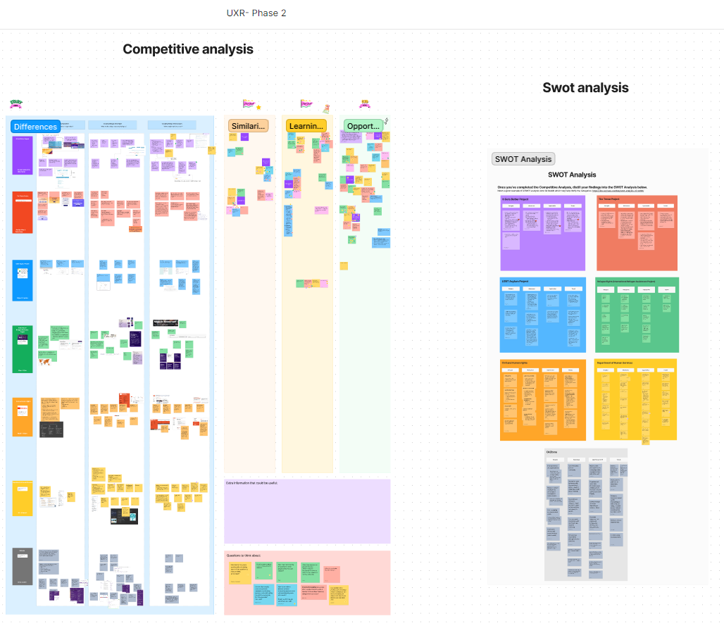
An additional early contract initiative was a competitive analysis of existing “resource centers”. This was cross collaborative with the research team.
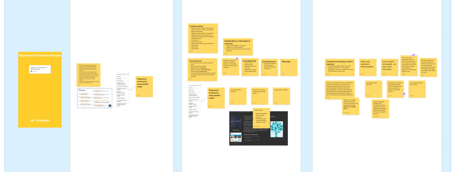
I buddied up with a UXR teammate and we performed a competitive analysis on the “Rhode Island Department of Human Services” resource center.
After a thorough heuristic evaluation and competitive analysis, the research team separated from our collaboration and completed 8 35-45 minute interviews. This validated most of the hypotheses we had about our user base.
The constraint takeaways of this research is as follows:
User Constraints
TDAConnect users struggle with low-bandwidth and low-data concerns, and often do not have consistent access to a private device.
The vast majority of TDAConnect users are LGBTQ+ identifying refugees/asylum seekers. They are often living in areas that are unsafe, meaning digital privacy and safety is paramount.
TDA Graduates desire above all else emotional connection, finding the healing and spiritual solace from connection the most important thing received from their work in TDA.
With this validation we have quite a few constraints to consider for our designs.
And if we had all the money and time in the world we could create a flawless system for our users.
Unfortunately, as is so often the case, we and our client are very limited in the resources we have access to.
The key constraints from the client side are as follows:
Client Constraints
SPI has limited staffing and time, so their capacity to manage the digital system we are creating is very low.
Due to low time, that also means our ability to connect and align with the client is limited.
SPI has limited funds, meaning that any solutions we come up with will need to be manageable on a budget.
So those are the constraints we’re working with.
Let’s get into it.

Ayana and her friend are at brunch.

Her friend mentions that his boss found out that he is queer. He’s heard that the boss isn’t queer friendly, and he’s worried about losing his job over it.

Ayana is concerned, and wants to help. She opens TDAConnect, because she trusts that, of anyone, they could help.

She explains to her friend that TDAConnect has a section for emergency resources just for situations like this, so maybe they can find something there that could help.

She navigates to Resources, and selects the Emergency Resources section.

She sees the notices for immediate help and reporting, but since they need more information, she chooses to filter to find info specific to his situation.
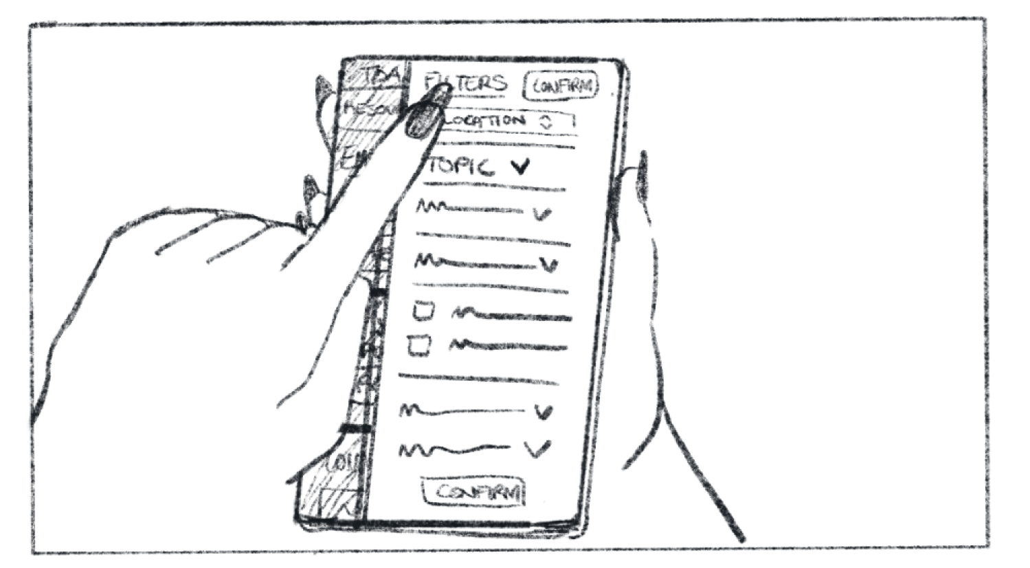
She taps the Location dropdown, since anything employment will be subject to local law.
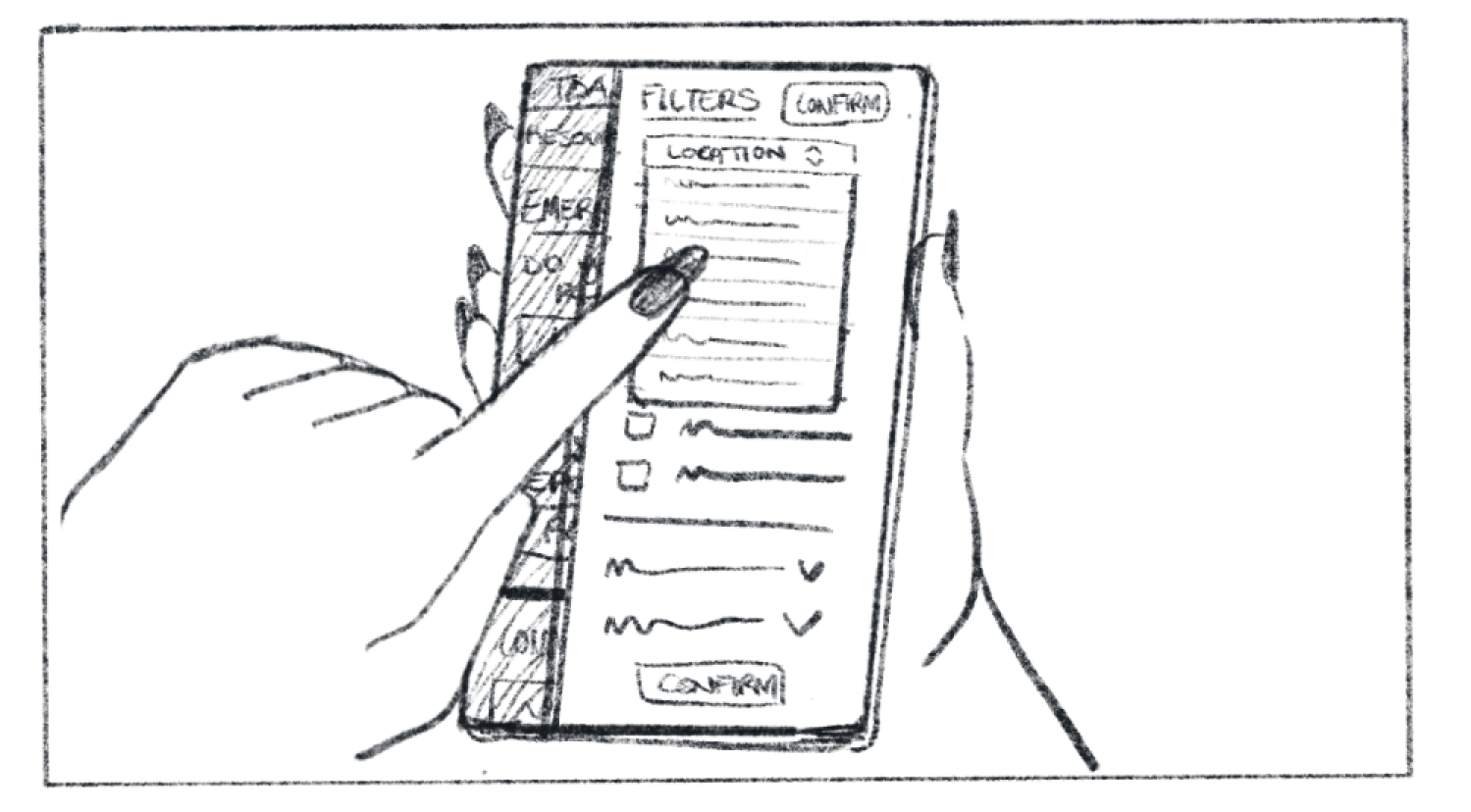
She taps their location.

She then taps Topic, to narrow down their search just to Law and Employment related resources.

She selects relevant topics, like Law+Rights, and Employment.

Satisfied, she selects “confirm” to implement the chosen filters.
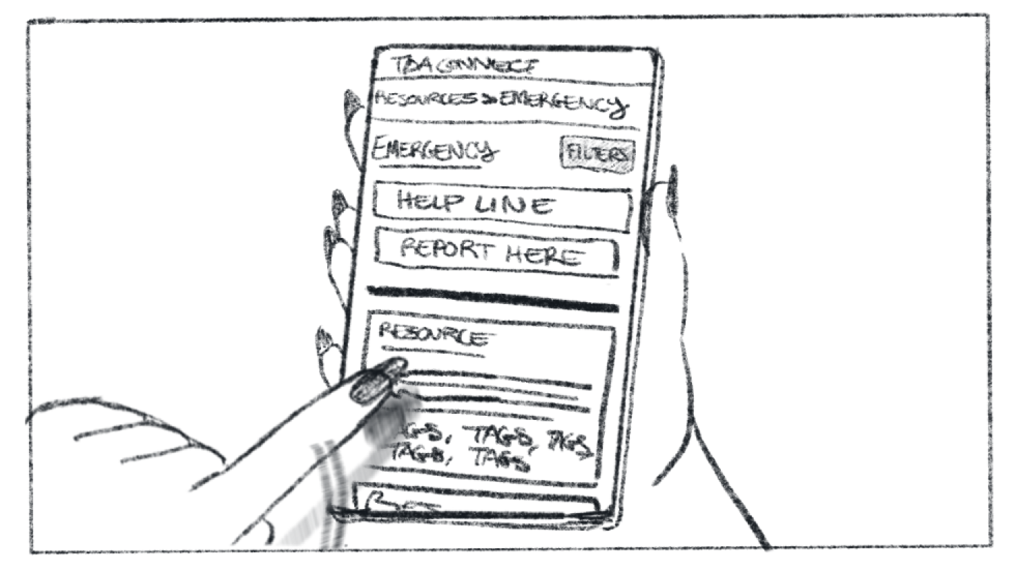
She scrolls through the results, looking for relevant info.

She notices a resource related to local employment anti-discrimination laws, and informs her friend.

She hands the phone to her friend, so he can read through it. She is sad he is going through this, but she is grateful she can support him however she can.
[ Note on the Storyboard: While the actual UX solution shown in this storyboard has changed since it was drawn, the meaning remains the same. This storyboard drawn by me was extremely useful in empathizing with the user in a stressful situation and visualizing the steps they’d need to take in order to complete their task. ]
Solving a Problem (with Libraries)
When you think about a resource center, what do you picture? I’d like to invite you to think of it like a library.
Take some time, and really consider a library.
Think of a real one that you’ve been to. Ask some questions about it.
Who built this library? How?
What did they fill it with?
Who filled it?
How did they decide what
goes where?
These questions were the first things we were asking ourselves as we began the post-preliminary-research design process.
It became clear through this open ended activity of asking questions how much our constraints would necessitate particular answers.
We weren’t even sure what our library was going to be filled with.
We did know that there were some resources that would be provided by the client, particularly post-graduate handouts, articles, and coursework.
But other than that we had the wide open possibilities that come with perceived future growth.
Remember, though, that our client is limited in their capacity.
There was no way they had the time or staff to dedicate to filling up a library.
So who would fill it then?
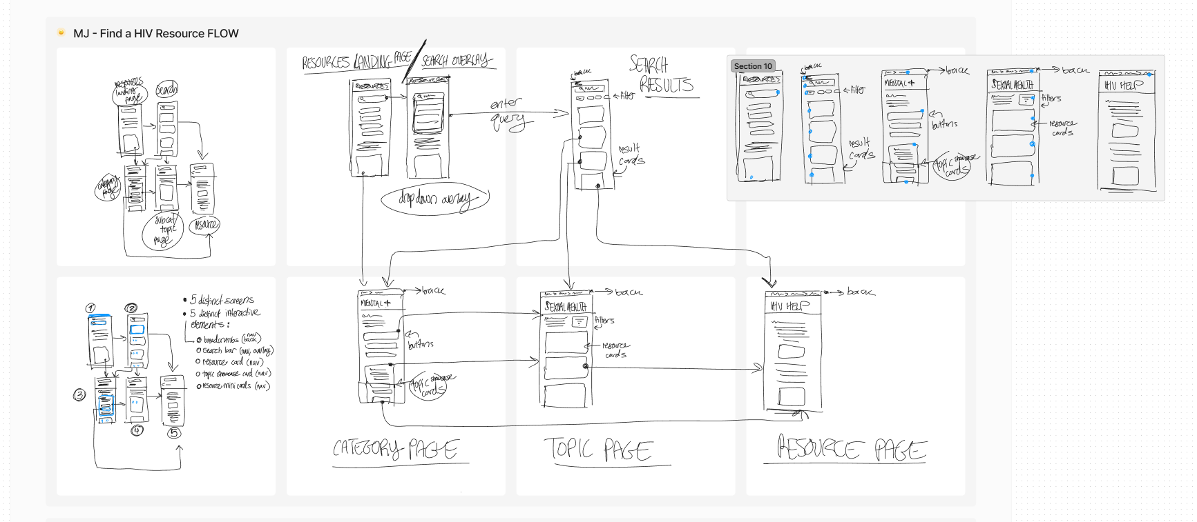
Iteration,
Thinking,
Iteration, Thinking,
Well, here’s where our problem gets interesting.
Constraints are only constraints when looked at through a specific lens. Shift the lens, and you might find a rare opportunity.
One of our user constraints was that above all else TDA graduates value emotional connection. They desire an ability to share their experiences with others, to help one another, to share joy and hope.
“... I think in my head where the best place [I can be] to accommodate the LGBTQ community”
“I mean, I’m now in a family. You know, when I say TDA, [that’s] family to me.”
“I like knowing what’s going on. Like, ... especially to do with the [LGBTQ+] community at large.”
Quotes from the UXR team’s interviews with TDA grads. These in particular highlight their investment in community.
If our client does not have the capacity to fill the library, then why not the users themselves?
They are already invested in the cause, and a few SPI staff members won’t have nearly the spread of experiences and knowledge of resources to pull on like a full user base.
This was a shift in our thinking. From the beginning we planned for the resource center to be entirely client side, with little interaction other than navigation and saving on the user side.
It required a pivot, but the constraints demanded it. After internal discussion and alignment from the client, we shifted the resource center to being community sourced.
Something I particularly pushed hard for was the integration of community submitted resources with SPI submitted resources.
There are pros and cons to integrating and not, but the main con for integrating is making the distinction between different kinds of resources clear. This was solved via the verified banner feature which you can see more of below.
The pros are that it would greatly simplify the sitemap, making it easier for users to navigate. And it would make searching for a resource easier (ie, a user looking for health related resources doesn’t need to search in two separate places).
It was important for our team to make sure everyone’s voice was heard, so votes were had often.
You can see the results of the vote for or against community resource integration here.
We had solved one constraint, and the project was moving in a direction everyone was excited about.
But as it so often goes, solving one problem opens up another.
If our resource center was community sources, how do we guarantee privacy and safety?
How do we guarantee privacy and safety with little to no client side moderation?
No moderation was instantly ruled out, as being patently unsafe and a generally bad user experience. But without robust moderation from SPI, what were our options?
We landed on relying on the community again, making the resource center community moderated.
Resource Card Evolution
The resource card components had to update as the center shifted to being community sourced and moderated.
You can see the thinking shifting through our designs as they evolved.
Particularly you can see how the verification banners were added in the middle of the process, then upvotes and downvotes, in order to accommodate a community moderated platform.
Mini-cards were created after lo-fi when we discovered that based on our IA we would need two sizes of cards to make the best use of the layout and space.
Sketch by me, Card Component owned and designed by Serena Hochmuth, Mini-Card Component owned and designed by me.
Community moderation is tricky, as it requires a lot of trust from the users to get right.
There are a few things about our situation that makes it more feasible, particularly:
TDAConnect will be accessible to TDA graduates only, meaning there is already a vetting process involved. This also means the community will be smaller and more interknit.
Our Dev team is working primarily on making the platform as safe for our users as possible, creating secure login structures and adding measures against information leaking (like limiting screenshots). This technical security will limit bad actors from accessing the community moderation tools.
On my team’s end we created a few embedded design structures that will directly assist community moderation:
I suggested and took charge of developing the idea for a verification banner system. Each post will begin with an “unverified” banner, and after a certain number of upvotes or downvotes will receive a “community verified” banner or go to a queue on SPI’s end for manual verification, respectively.
Any resources posted from verified SPI staff accounts will automatically be issued an “SPI verified” banner.
A flagging system, for users to directly request SPI staff to look at a post for inappropriate content.
Wrap Up
The story of this project, and even the resource center, isn’t over.
As a team in an interior phase of this project, we were building up designs with the direct intention to pass them along at the end of our contract.
We were able to complete multiple interactive prototypes at the end of our fourth sprint.
These will be handed off to Phase 3, who will test them with real users to uncover errors, frictions, and overlooked problems. Then those problems will be resolved with solutions in the next step of the iterative process.
The Phase 3 design teams will also be working even more closely with the development teams to maintain and manage technical feasibility.
While there is still work to be done, our work in Phase 2 was crucial to the success of our project.
By designing with our constraints in mind we were able to come up with designs that will assist community moderation with low input from the client side.
The iterations we did moved the project forward and towards a functional and feasible product that meets both client and user needs.
Cherie, one of our client stakeholders, said it best I believe:
Cherie Singh, SPI Director of Operations
“I just want to give big, big, big kudos to the [UX] Design 2 team for having TDA coursework along with the resources - it’s so, so beneficial.
... I’m so happy and deeply grateful for everything that all of you have put in and are doing currently.
... This platform is gonna have such a big impact on our community.”

Mock Ups
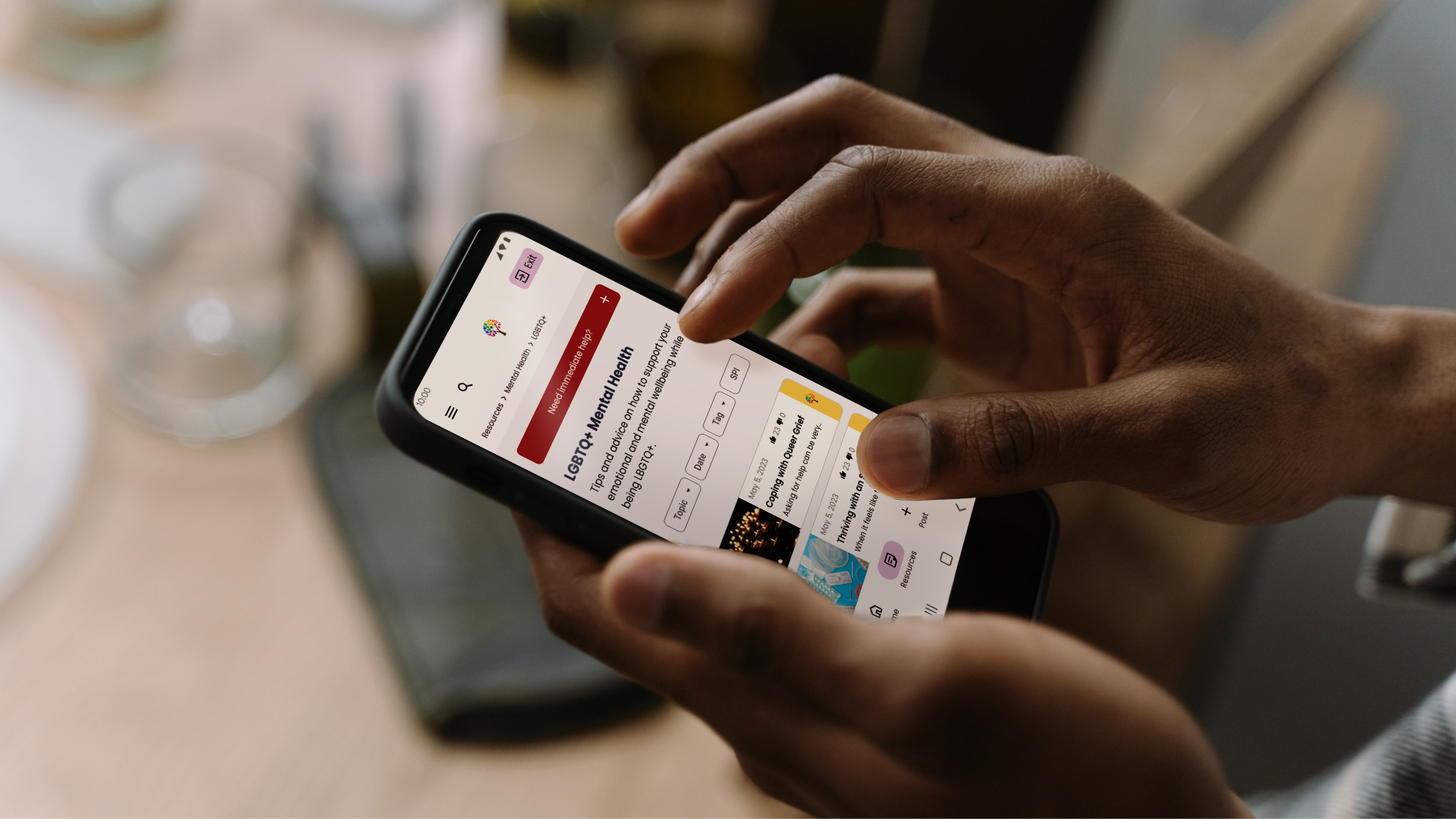
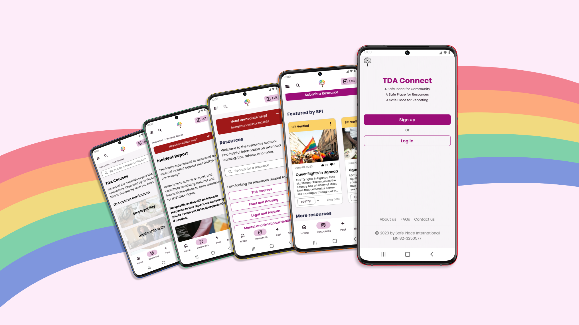
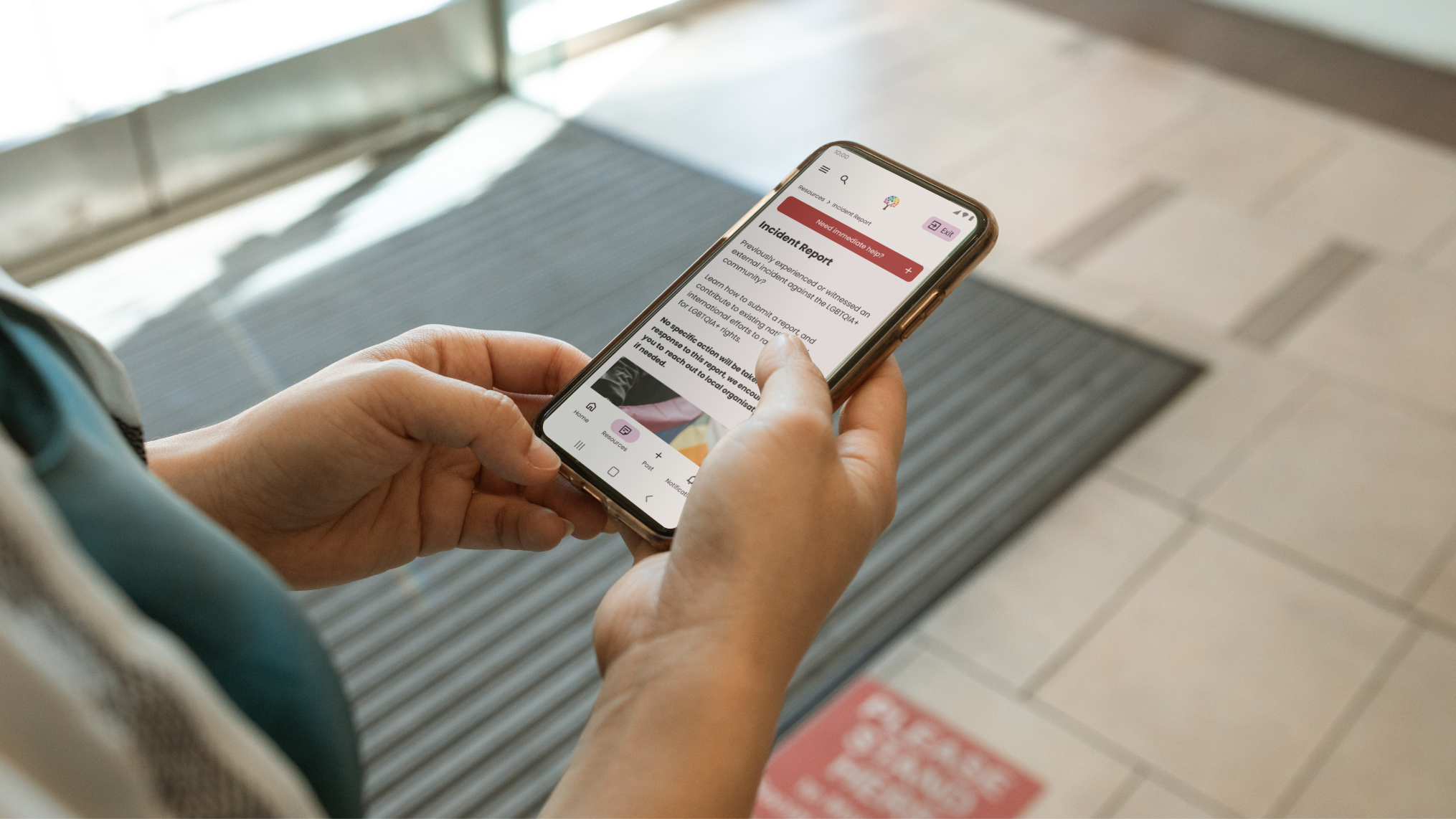
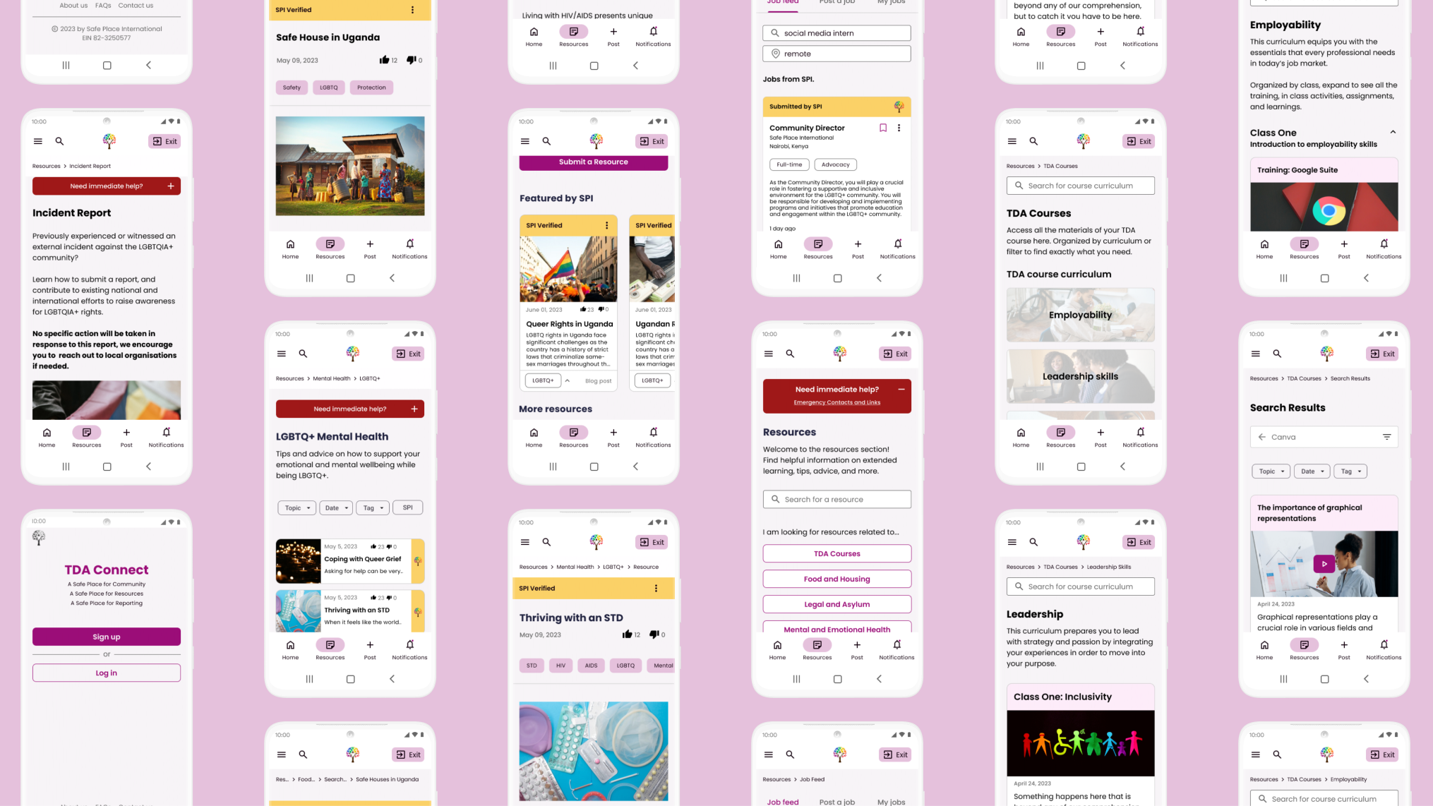
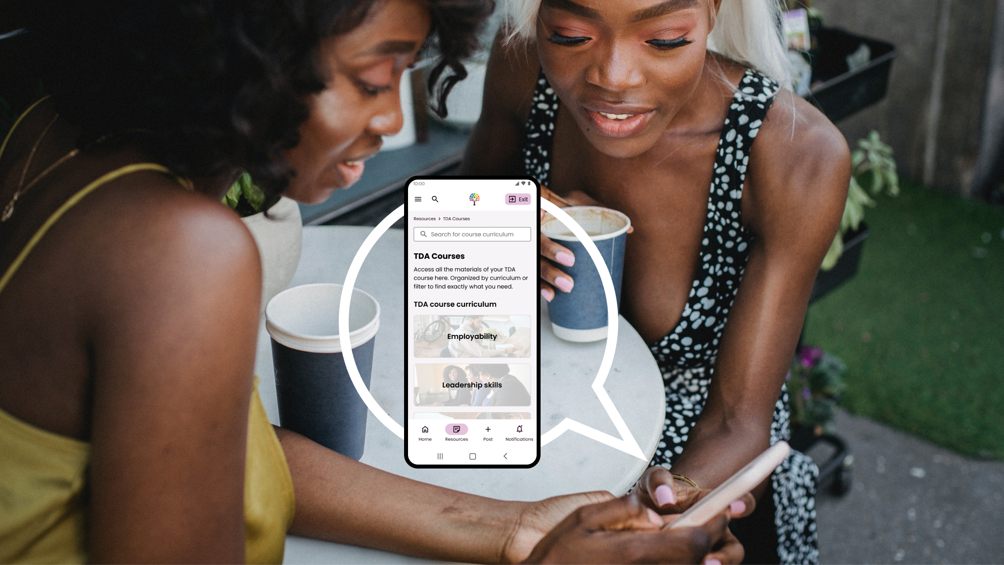
Ta Da, A Prototype!
This is a walkthrough of our interactive prototype of a user searching through the “Health” sections of the resource center.
I was in charge of this flow, from design to presentation, and the script in this video is what was presented to the client during the final demo for this phase.


